

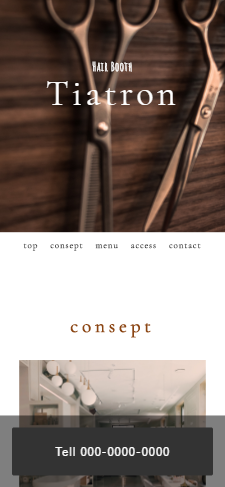
架空の美容室サイトを作りました。
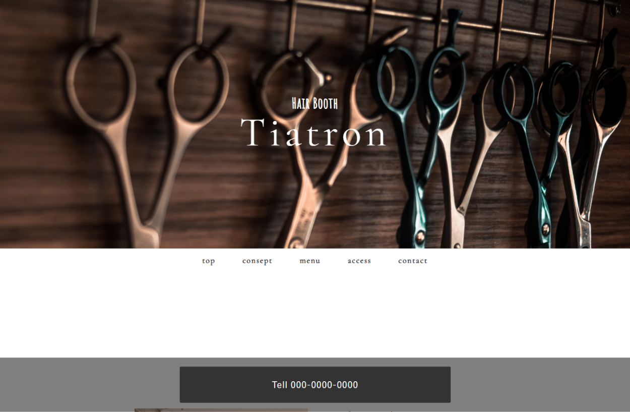
落ち着いた雰囲気をアピールしており、暗めの色使いを意識しました。
シンプルで必要な情報のみを記載し、分かりやすいレイアウトを意識しました。
新規のお客様が電話予約をしやすいように画面下のバナーにposition: sticky ;を使用し、
常にページ下部に電話用のボタンが配置されるように設計しました。
下記、html,cssコード
html
<!DOCTYPE html>
<html>
<head>
<meta charset="utf-8">
<meta name="viewport" content="width=device-width,initial-scale=1.0,user-scalable=no">
<meta name="description" content="行橋の美容室ティアトロンのWebサイトです。" />
<title>行橋市の美容室ティアトロン</title>
<link href="https://fonts.googleapis.com/css?family=Cormorant+Garamond&display=swap" rel="stylesheet">
<link href="https://fonts.googleapis.com/css?family=Amatic+SC&display=swap" rel="stylesheet">
<link href="css/reset.css" media="all" rel="stylesheet" type="text/css" />
<link href="css/style.css" media="all" rel="stylesheet" type="text/css" />
<link rel="shortcut icon" href="img/favicon01.ico" />
</head>
<body>
<div id="wrapper">
<header id="header">
<h1 class="logo">
<span class="logo-name">Hair Booth</span>
<span class="logo-title">Tiatron</span>
</h1>
</header>
<nav id="gnav">
<ul>
<li><a href="#header">Top</a></li>
<li><a href="#consept">consept</a></li>
<li><a href="#menu">menu</a></li>
<li><a href="#access">access</a></li>
<li><a href="#contact">contact</a></li>
</ul>
</nav>
<main id="contents">
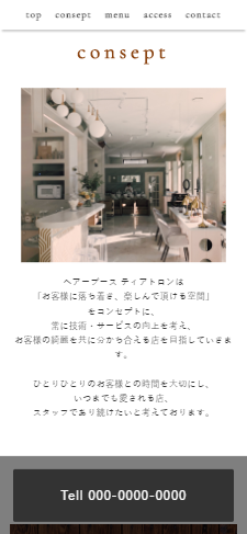
<section class="section" id="consept">
<div class="inner">
<div class="section-title-block">
<h2 class="section-title">consept</h2>
</div>
<div class="two-column-wrapper">
<div class="two-column-image">
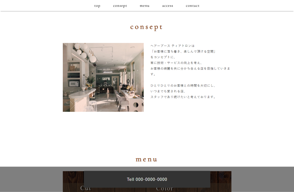
<img src="img/consept/hairsalon.jpg" alt="">
</div>
<div class="two-column-desc">
<p class="text">
ヘアーブース ティアトロンは<br>「お客様に落ち着き、楽しんで頂ける空間」<br>をコンセプトに、<br>常に技術・サービスの向上を考え、<br>お客様の綺麗を共に分かち合える店を目指していきます。<br><br>ひとりひとりのお客様との時間を大切にし、<br>いつまでも愛される店、<br>スタッフであり続けたいと考えております。
</p>
</div>
</div>
</div>
</section>
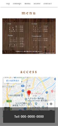
<section class="section" id="menu">
<div class="inner">
<div class="section-title-block">
<h2 class="section-title">menu</h2>
</div>
<div class="card-wrapper my-gallery">
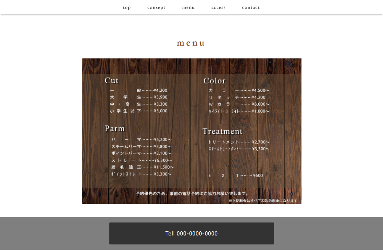
<img src="img/menu.png">
</div>
</div>
</section>
<section class="section" id="access">
<div class="inner">
<div class="section-title-block">
<h2 class="section-title">access</h2>
</div>
<div class="two-column-wrapper1">
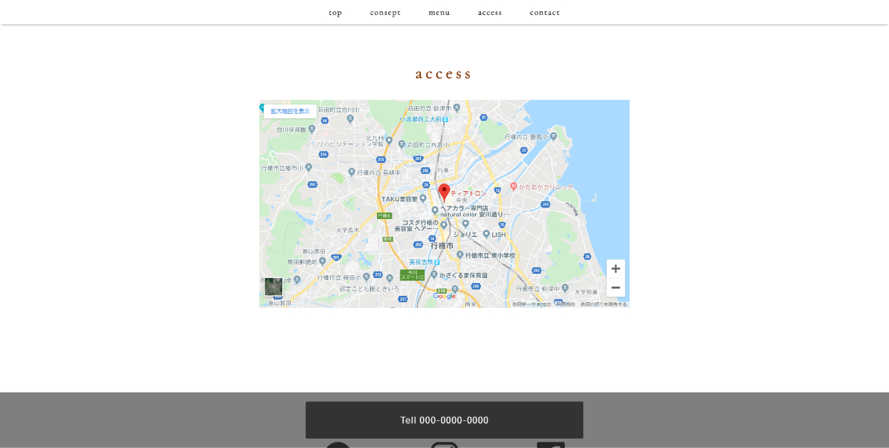
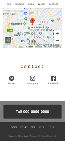
<iframe src="https://www.google.com/maps/embed?pb=!1m14!1m8!1m3!1d26550.436222692995!2d130.9611637330217!3d33.71400660612963!3m2!1i1024!2i768!4f13.1!3m3!1m2!1s0x0%3A0x786763fc018e8361!2z44OG44Kj44Ki44OI44Ot44Oz77yIdGlhdHJvbu-8iQ!5e0!3m2!1sja!2sjp!4v1575301446317!5m2!1sja!2sjp" width="800" height="450" frameborder="0" style="border:0;" allowfullscreen=""></iframe>
</div>
</div>
</section>
<section class="section" id="contact">
<div class="inner">
<div class="section-title-block">
<h2 class="section-title">contact</h2>
</div>
<div class="contact-wrapper">
<div class="contact-list">
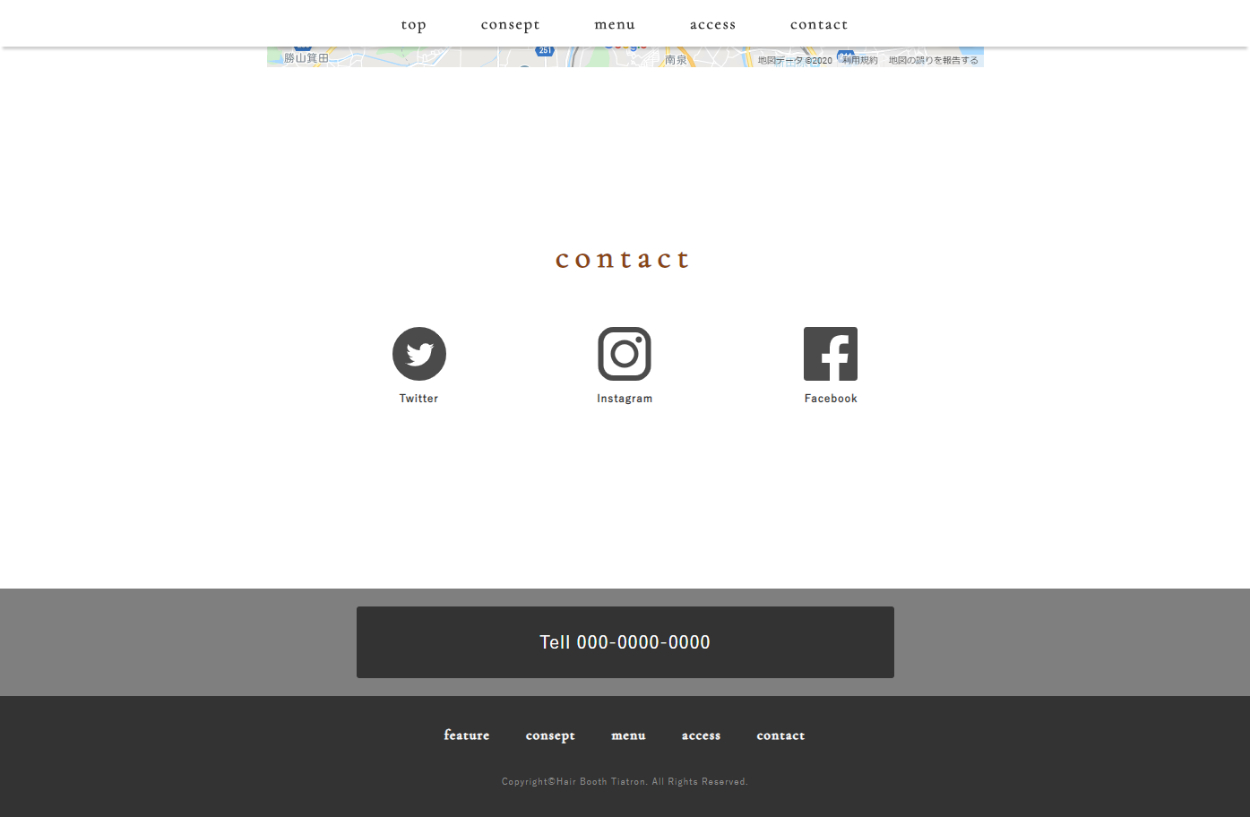
<ul>
<li><a href="#"><img src="img/twitter.svg" alt=""><span
class="contact-list-desc">Twitter</span></a></li>
<li><a href="#" target="_blank"><img src="img/instag.svg" alt=""><span
class="contact-list-desc">Instagram</span></a></li>
<li><a href="#" target="_blank"><img src="img/facebook.svg" alt=""><span
class="contact-list-desc">Facebook</span></a></li>
</ul>
</div>
</div>
</div>
</section>
</main>
<div class="tell">
<a href="tel:000-0000-0000" role="button">Tell 000-0000-0000</a>
</div>
<footer id="footer">
<div class="inner">
<nav class="footer-link">
<ul>
<li><a href="#feature">FEATURE</a></li>
<li><a href="#consept">consept</a></li>
<li><a href="#menu">menu</a></li>
<li><a href="#access">access</a></li>
<li><a href="#contact">CONTACT</a></li>
</ul>
</nav>
<p class="copyright">Copyright©Hair Booth Tiatron. All Rights Reserved.</p>
</div>
</footer>
</div>
</body>
</html>
css
/* CSS Document */
*,
*:before,
*:after {
-webkit-box-sizing: border-box;
-moz-box-sizing: border-box;
-o-box-sizing: border-box;
-ms-box-sizing: border-box;
box-sizing: border-box;
}
body {
font-family: 'ヒラギノ角ゴ Pro W3', 'Hiragino Kaku Gothic Pro', "游ゴシック Medium", "Yu Gothic Medium", "游ゴシック体", YuGothic, 'メイリオ', Meiryo, Osaka, 'MS Pゴシック', 'MS PGothic', sans-serif;
color: #333;
font-size: 15px;
line-height: 1.8;
letter-spacing: .8px;
word-break: break-all;
}
a {
color: #1ca9e3;
text-decoration: none;
}
a:hover,
a:hover img {
opacity: .8;
-webkit-transition: all .3s;
-moz-transition: all .3s;
-ms-transition: all .3s;
-o-transition: all .3s;
transition: all .3s;
}
img,
video,
object {
max-width: 100%;
height: auto;
border: none;
vertical-align: bottom;
display: block;
}
ul,
li {
list-style: none;
}
/*--------------------------------
全体
---------------------------------*/
#wrapper {
background-color: #fff;
}
.inner {
max-width: 1320px;
width: 100%;
margin: 0 auto;
padding: 0 10px;
}
#contents {
padding: 100px 0;
}
.tell {
position: sticky;
bottom: 0;
background-color: rgba(0, 0, 0, .5);
padding: 20px;
text-align: center;
position: -webkit-sticky;
}
.tell a {
background-color: #333;
border-radius: 3px;
color: #fff;
display: inline-block;
font-size: 20px;
height: 80px;
line-height: 80px;
max-width: 600px;
text-decoration: none;
width: 100%;
}
/*--------------------------------
ヘッダー
---------------------------------*/
#header {
background-image: url(../img/header.jpg);
background-size: cover;
background-repeat: no-repeat;
display: -webkit-box;
display: -ms-flexbox;
display: flex;
-webkit-box-pack: center;
-ms-flex-pack: center;
justify-content: center;
-webkit-align-items: center;
-ms-align-items: center;
align-items: center;
height: 550px;
}
#header .logo {
display: block;
}
#header .logo-name {
display: block;
font-family: 'Amatic SC', cursive;
font-size: 32px;
line-height: 1;
text-align: center;
color: white;
margin-bottom: 5px;
}
#header .logo-title {
font-family: 'Cormorant Garamond', serif;
font-size: 90px;
font-weight: normal;
color: white;
line-height: 1;
letter-spacing: .1em;
}
/*--------------------------------
グローバルナビ
---------------------------------*/
#gnav {
padding: 10px;
font-family: 'Cormorant Garamond', serif;
z-index: 100;
width: 1920px;
width: 100%;
}
#gnav ul {
display: -webkit-box;
display: -ms-flexbox;
display: flex;
-ms-flex-wrap: wrap;
flex-wrap: wrap;
-webkit-box-pack: center;
-ms-flex-pack: center;
justify-content: center;
}
#gnav li {
padding: 0 30px;
}
#gnav li a {
font-weight: bold;
font-size: 18px;
color: #333;
letter-spacing: .1em;
text-transform: lowercase;
}
#gnav.fixed {
position: fixed;
top: 0;
left: 0;
width: 100%;
background-color: #fff;
box-shadow: 0px 6px 3px -3px rgba(0, 0, 0, 0.2);
-webkit-box-shadow: 0px 6px 3px -3px rgba(0, 0, 0, 0.2);
-moz-box-shadow: 0px 6px 3px -3px rgba(0, 0, 0, 0.2);
transform: translate3d(0, 0, 0);
}
/*--------------------------------
Section
---------------------------------*/
.section .inner {
padding: 80px 10px;
}
.section .section-title-block {
text-align: center;
margin-bottom: 30px;
}
.section .section-title {
font-family: 'Cormorant Garamond', serif;
text-transform: lowercase;
letter-spacing: .2em;
display: inline-block;
font-size: 36px;
line-height: 1;
margin-bottom: 10px;
color: #8B4513;
}
.two-column-wrapper {
max-width: 800px;
margin: 0 auto;
padding: 20px 0;
display: -webkit-box;
display: -ms-flexbox;
display: flex;
-ms-flex-wrap: nowrap;
flex-wrap: nowrap;
-webkit-box-pack: justify;
-ms-flex-pack: justify;
justify-content: space-between;
}
.two-column-image {
width: 50%;
}
.two-column-image img {
margin-right:0;
width: 100%;
}
.two-column-desc {
width: 50%;
}
/*--------------------------------
consept
---------------------------------*/
#consept .two-column-image {
width: 48%;
}
#consept .two-column-desc {
width: 48%;
}
/*--------------------------------
menu
---------------------------------*/
#menu .card-wrapper {
padding: 0 0;
display: -webkit-box;
display: -ms-flexbox;
display: flex;
-ms-flex-wrap: wrap;
flex-wrap: wrap;
-webkit-box-pack: justify;
-ms-flex-pack: justify;
justify-content: space-between;
text-align: center;
margin: 10px auto;
max-width: 800px;
}
#menu .card-wrapper img{
width: 100%;
}
/*--------------------------------
access
---------------------------------*/
#access .two-column-wrapper1 {
text-align: center;
}
/*--------------------------------
contact
---------------------------------*/
#contact .contact-list {
padding: 20px 0;
}
#contact .contact-list ul {
width: 40%;
margin: 0 auto;
display: -webkit-box;
display: -ms-flexbox;
display: flex;
-ms-flex-wrap: wrap;
flex-wrap: wrap;
-webkit-box-pack: justify;
-ms-flex-pack: justify;
justify-content: space-between;
align-self: flex-end;
;
}
#contact .contact-list li {
text-align: center;
}
#contact .contact-list li a {
color: #333;
}
#contact .contact-list li img {
width: 60px;
margin: 0 auto 5px;
}
#contact .contact-list-desc {
font-size: 12px;
font-weight: bold;
}
/*--------------------------------
Footer
---------------------------------*/
#footer {
background-color: #333;
}
#footer .inner {
padding: 30px;
}
#footer .footer-link ul {
font-family: 'Cormorant Garamond', serif;
letter-spacing: .1em;
text-transform: lowercase;
margin-bottom: 30px;
display: -webkit-box;
display: -ms-flexbox;
display: flex;
-ms-flex-wrap: wrap;
flex-wrap: wrap;
-webkit-justify-content: center;
-moz-justify-content: center;
justify-content: center;
}
#footer .footer-link li {
font-size: 15px;
padding: 0 20px;
}
#footer .footer-link li a {
color: #fff;
font-weight: bold;
}
#footer .copyright {
font-size: 10px;
color: #8c8c8c;
text-align: center;
}
/*media Queries 767
----------------------------------------------------*/
@media screen and (max-width: 767px) {
body {
font-size: 13px;
line-height: 1.7;
}
#header {
height: 60vh;
}
#header .logo-title {
font-size: 60px;
}
#header .logo-name {
font-size: 20px;
}
#header .logo-desc {
font-size: 10px;
}
#gnav li {
padding: 0 10px;
}
#gnav li a {
font-size: 15px;
}
#gnav li a:hover {
opacity: 1;
}
#contents {
padding: 40px 0;
}
.section .inner {
padding: 30px 15px;
}
.section .section-title-block {
margin-bottom: 10px;
}
.section .section-title {
font-size: 32px;
}
#consept .two-column-wrapper {
width: 100%;
-ms-flex-wrap: wrap;
flex-wrap: wrap;
}
#consept .two-column-image {
width: 90%;
margin: 0 auto 20px;
}
#consept .two-column-desc {
width: 100%;
}
#consept .two-column-desc {
text-align: center;
}
#menu .two-column-wrapper {
width: 100%;
-ms-flex-wrap: wrap;
flex-wrap: wrap;
}
#menu .two-column-image {
width: 50%;
margin: 0 auto 20px;
}
#menu .two-column-desc {
width: 100%;
}
#access .two-column-wrapper1{
position:relative;
width:100%;
height:0;
padding-top:75%;
}
#access .two-column-wrapper1 iframe {
position:absolute;
top:0;
left:0;
width:100%;
height:100%;
}
#contact .contact-list ul {
width: 100%;
}
#contact .contact-list li {
flex-basis: 30%;
}
#contact .contact-list li img {
width: 30px;
}
#contact .contact-list-desc {
font-size: 12px;
}
#footer .inner {
padding: 20px 0;
}
#footer .footer-link li {
font-size: 10px;
padding: 0 10px;
margin-bottom: 5px;
}
}